

Usability is a quality attribute that assesses how easy user interfaces are to use. The word “usability” also refers to methods for improving ease-of-use during the design process. The Weekly Observer is a Ugandan tri weekly newspaper headquartered in Kampala. It is one of the largest privately owned papers in the country and runs an online website (www.observer.ug)
www.observer.ug lives up to design and content principle in the following ways;
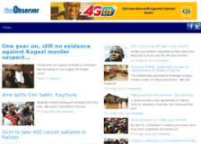
Distinct and unique navigation panel. Navigation menu is a map and directions of a website and usually what gets users deeper into the site experience. A key component of good usability and a successful website. The Observer website has visually separated and easy to find categories. Navigation text stands out different from the font size or the body text. High contrast colors are used for navigation buttons making it easy for readers to see and click according to their choices.
The Observer website is not puzzled and it is not extraordinary but rather simple. Observer helps its online visitors to quickly see what information is available and where to go to find it. Customers are able to anticipate how the site works without having to learn what to do.
Consistency is another website usability principle visible on the Observer website. The site uses same navigation model in all its pages. This is very important because without a consistent design, a user may actually think he is in another website. Observer uses the same navigation model and users easily go about http://www.observer.ug without being lost.

Observer menus link one to exactly what they say. Simple, obvious and terms that are easy to figure out are used on headlines and titles. Descriptive images are more eye-catching than the text, Observer uses blue coloured headlines and black summaries ensure that the readers see and click on the stories. Our brains process visual information much faster than textual information. That’s why it is a great idea to help your visitors out with some easy to interpret visuals.
Observer website is ordered, the most important items are posted on the left, and the least important items in the middle. People’s attention is highest for things that appear at the beginning and at the end. Psychologists call it the “serial position effect”, it’s based on the principles of primacy and recency.
The Observer website has a well-structured layout, along with clear website information architecture. It figures out key features the website offers, what’s most important and what’s less important as placed in lower levels in the website hierarchy.
Accessible and Clickable. www.observer.ug navigation elements have clickable links. All heading elements are clickable links. This is true even with drop-down menus where clicking a sub-category link may be the natural inclination of the visitor.
The clicks on each link or category do not result into sound each time a reader rolls over the mouse to any navigation category. People do not enjoy surprises like that. Even if you find the sound very interesting it gets annoying very soon.
www.observer.ug is a responsive to mobile devices such as iPad, which are becoming a more and more popular way of connecting to the internet. This provides a good solution for this growing mobile traffic. Single page fit for many different devices and screen sizes. Which also require a responsive solution for your navigation menu.
A drop down menu should appear seamlessly and without interruption. The menu should load immediately. Don’t make very heavy drop down menus that may takes more than an instant to load upon the hover.
www.observer.ug is not animated and appears seamless without any drop down menu. Apart from advertisements, the content is simply appearing. Observer should consider adding a wipe down, rotate or fade in, animation effects. The transition must be quick and not disruptive. More abstract icons or colors are great for recurring visitors to remember a content category they were particularly interested in.
Sticky menu. The Observer menu is static on to one space and does not disappear when the user scrolls down the page.
In conclusion, navigation plays a key role in creating a great user experience, prolonging the site stay and increasing engagement.
Observer can follow these principles to improve its website menu, however if the layout is unique, it can be maintained.
 Catherine Eye